Champion Party
Website Redesign: Escaping the Clown Circus for Vintage Charm
ROLE: Solo Product Designer | Timeline: 3 weeks (May - June 2024)
Project Overview
Champion Party Supply initially focused on signage and evolved to providing costumes and makeup for vaudeville performers. It finally transitioned fully into the party and costume industry. Today, Champion Party Supply continues to provide party supplies and costumes, honoring its rich history while serving the Seattle community.
The website seemed more like a Halloween shop
CHALLENGE
Users didn't trust the website because the design was unattractive and didn't follow key user experience and accessibility guidelines. This made it hard for users to find items or shop with confidence.
Revamp the website with a redesign to build trust with customers
SOLUTION
DISCOVER
Analyzing Shoppers Frustrations
RESEARCH
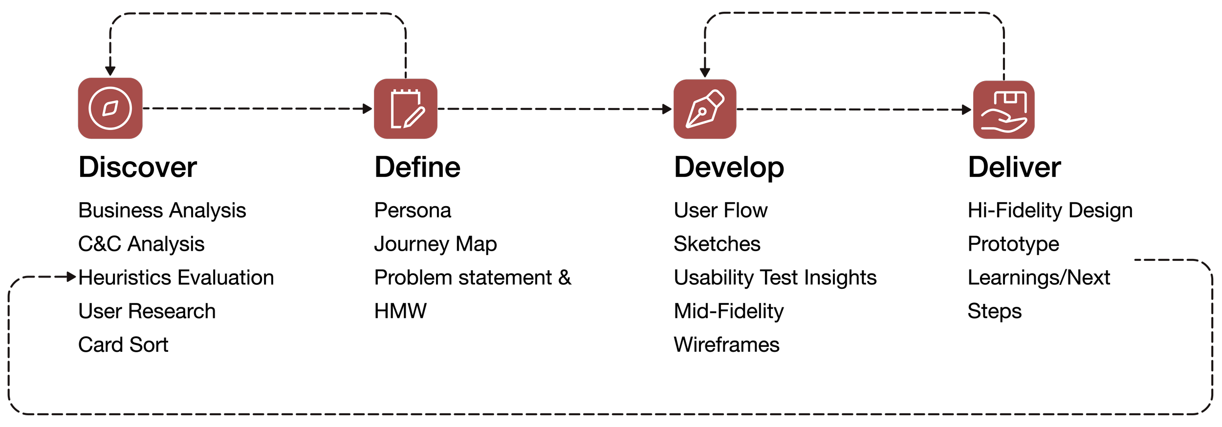
I wanted to dive deep into the business and understand the challenges their customers face through business research, competitive & comparative analysis, heuristic evaluation and user interviews.
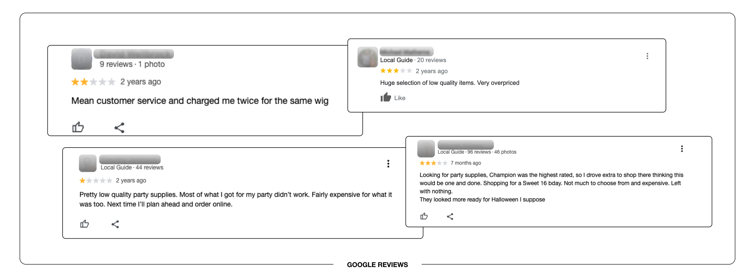
I delved into the store’s Google reviews
BUSINESS RESEARCH
To gain insights from actual customers. Reviews highlighted concerns such as; “A messy store layout and its difficult to find items”. Some reviews suggesting a “Halloween-centric vibe”
Identifying key essential features
COMPETITIVE + COMPARATIVE ANALYSIS
A competitive and comparative analysis revealed several gaps in Champion Party's website compared to leading party supply and top industry e-commerce websites. Key missing features include prominently displayed featured products, comprehensive product descriptions, and a clear and concise order summary.
Businesses used to perform a competitive and comparative analysis. View full analysis
To identify usability issues and recommend improvements
HEURISTICS EVALUATION
A heuristic evaluation was done, finding violations mostly focused on these principles:
Visibility of systems status
Flexibility and efficiency of use
Aesthetic and minimalist design
Visibility of system status
When you click a menu category, the arrow goes up or down. Having multiple arrows can make it hard to tell which menu was clicked.
Visibility of system status
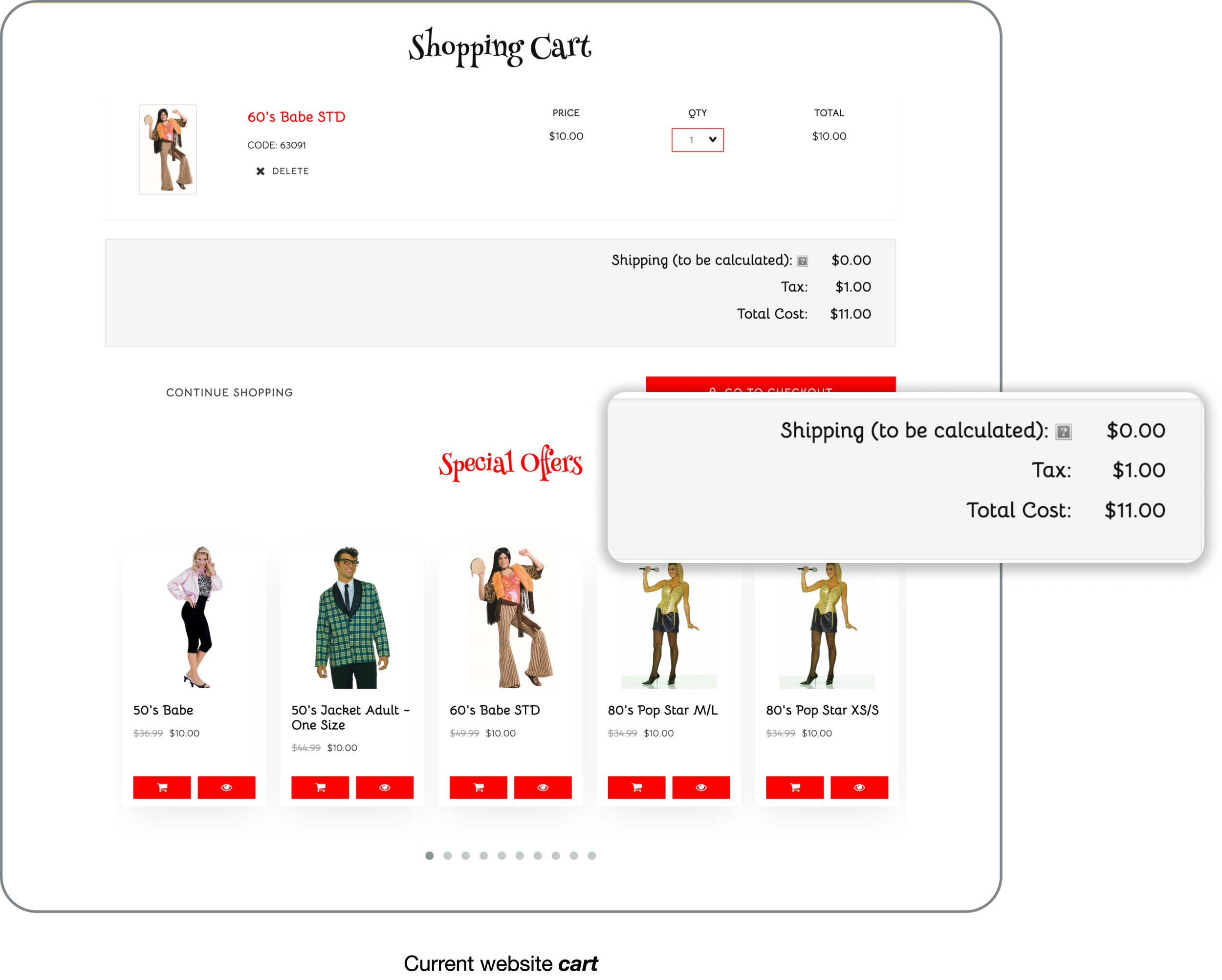
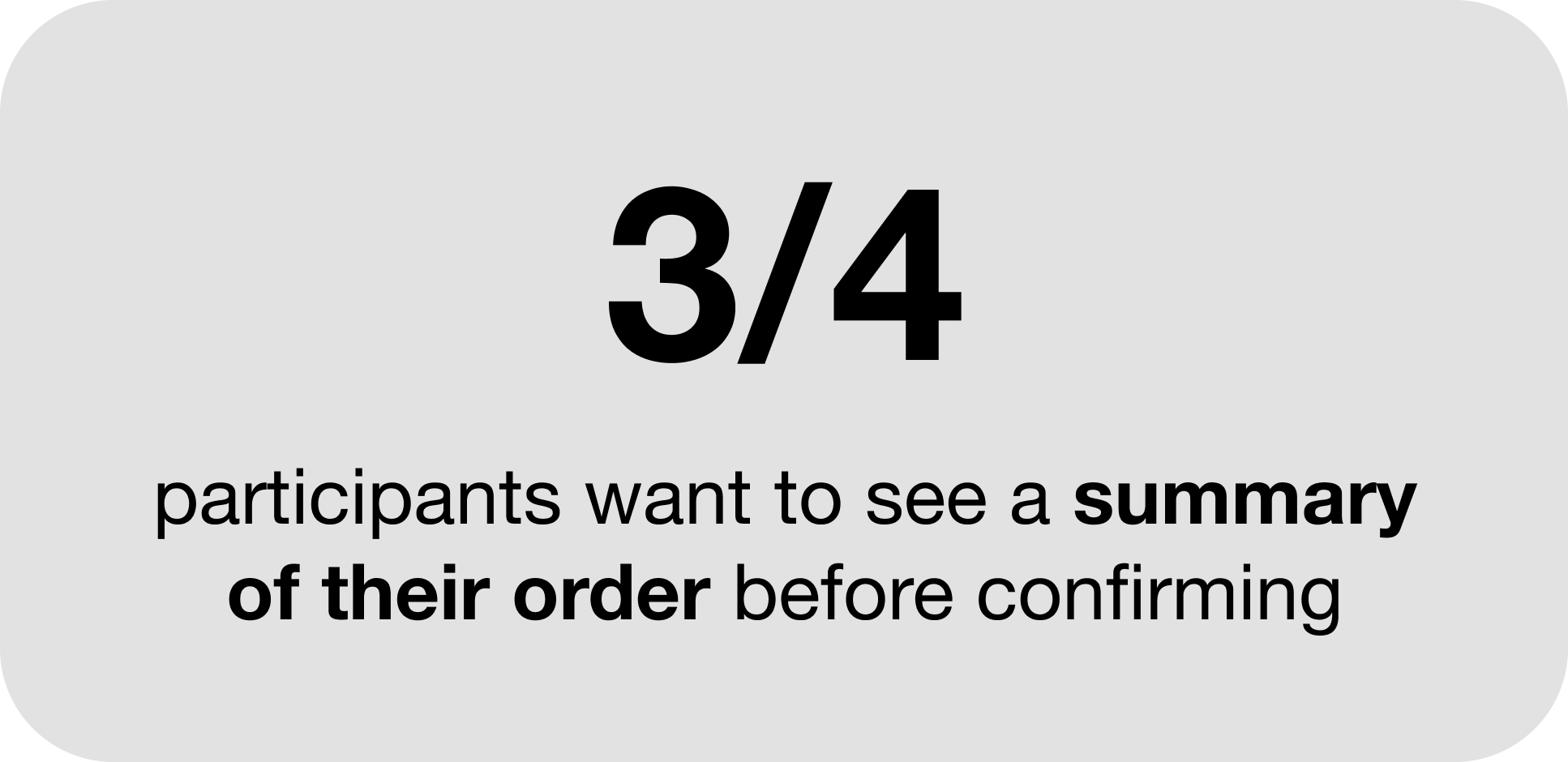
Lack of a detailed “summary of order.” Without this, users may feel uncertain about their transactions, leading to a lack of trust and confidence in the website.
Flexibility and efficiency of use
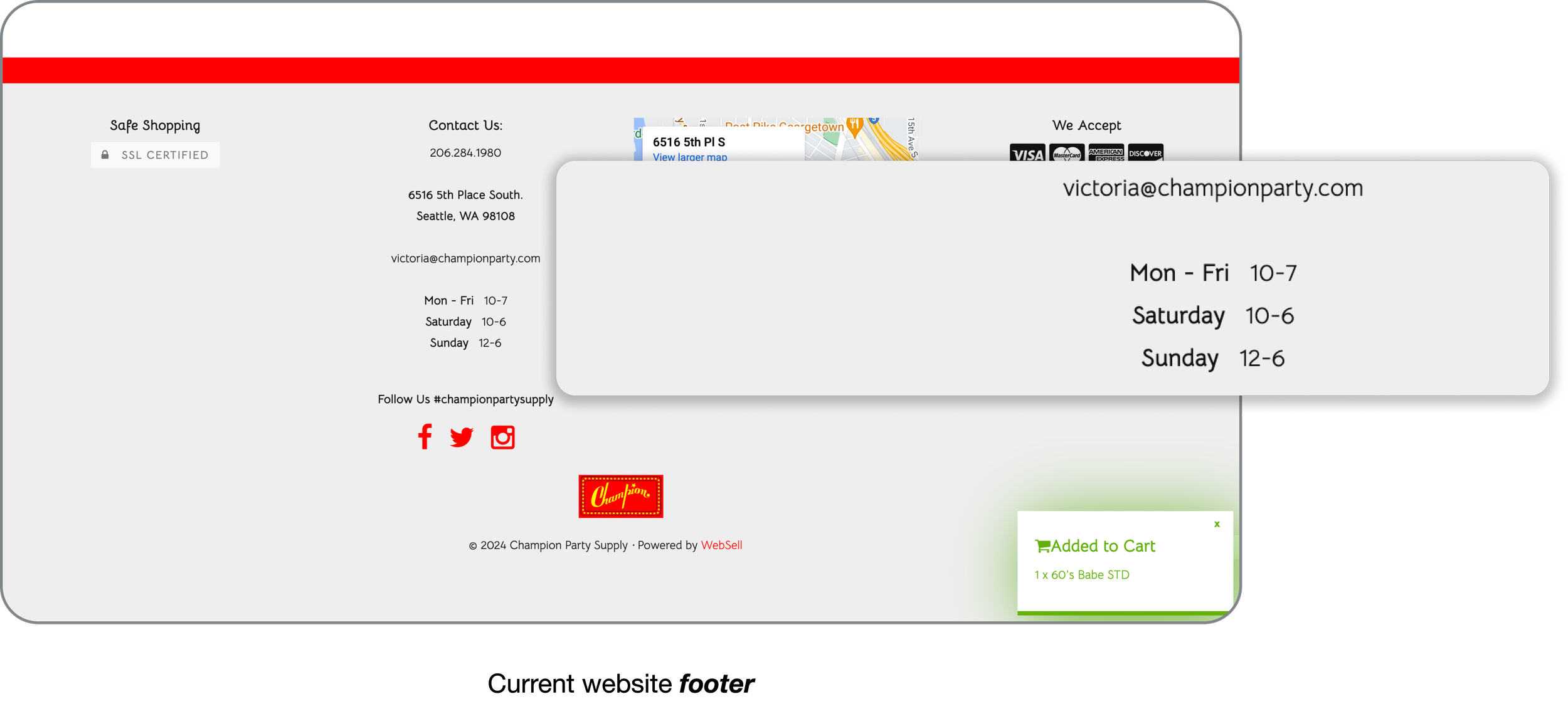
The website footer lacked a clear and organized structure, which will result to a cluttered and confusing user experience.
Identified recurring themes and concerns
USER INTERVIEWS
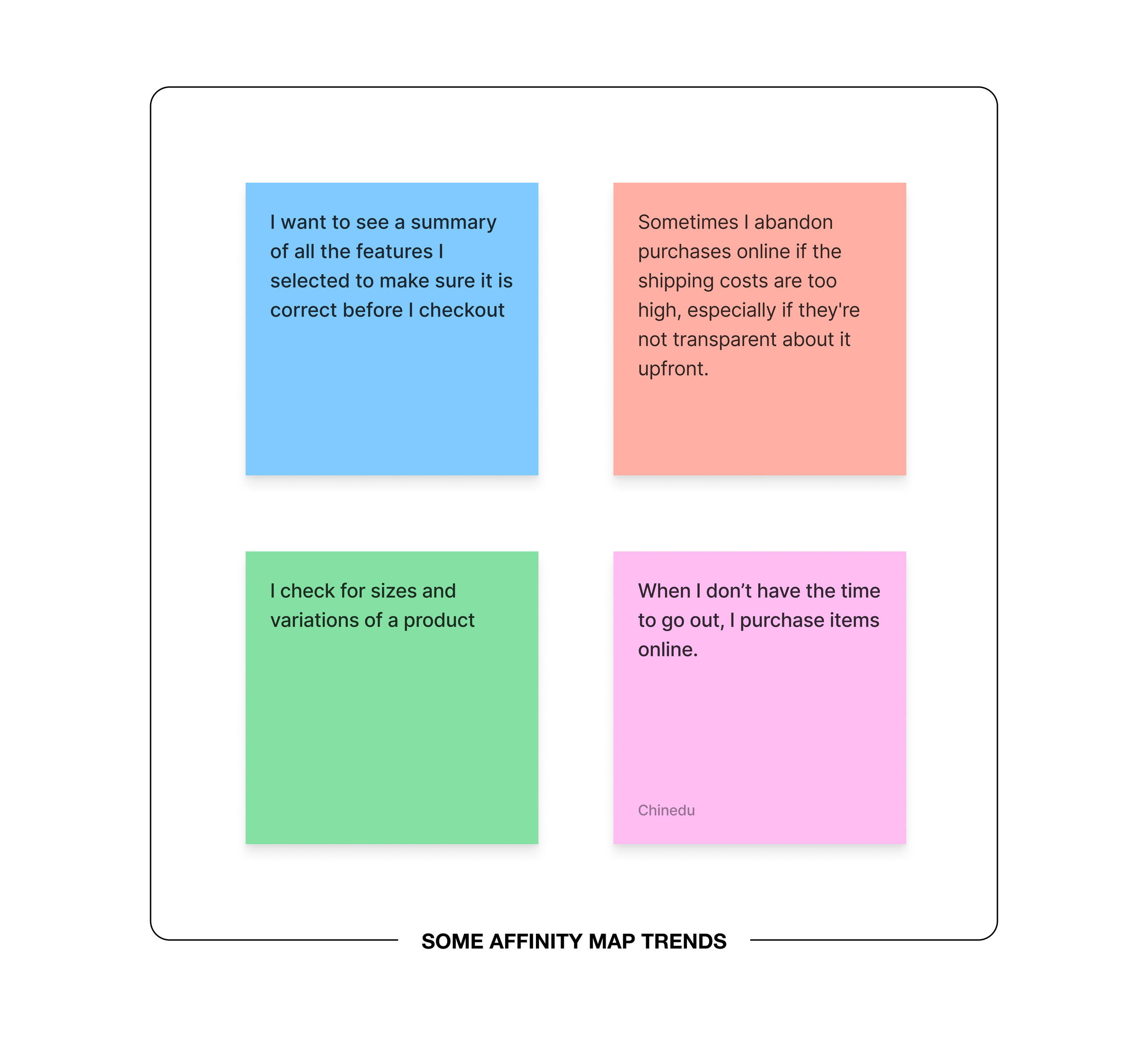
A To glean further user pain points, I conducted 4 user interviews, selecting participants who had shopped online recently, particularly for party supplies. I asked them questions focused on understanding their overall behavior around shopping. I finally synthesized my data through affinity mapping. Common trends were safety and the need for product quality assurance before purchase.
Research Questions
Can you talk about some of the factors that make you choose to shop for event or seasonal supplies online versus in-store?
What made you decide to buy party supplies online instead of going to a physical store? Why?
How do you feel about the checkout process when purchasing items online?
Can you walk me through a recent experience of browsing and selecting event or seasonal supplies on an e-commerce website?
Full Affinity Map
Interviewees Mostly Discussed Feeling Safe
RESEARCH INSIGHTS
While reviewing the interview data, I noticed that online shoppers care most about feeling safe and trusting the websites they use. They want online shopping to be as easy and secure as shopping in a store. Trust and security are key to making their online shopping experience worry-free and stress-free.
“It is just convenient for me to order and have my items delivered”
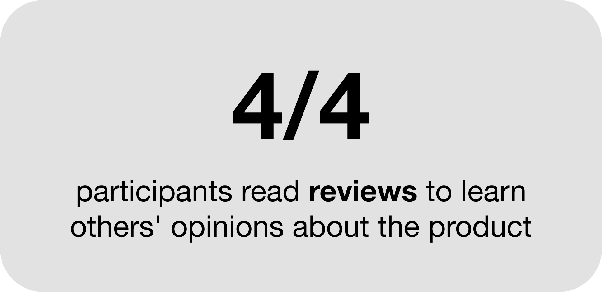
“Being able to read reviews of products makes my shopping experience memorable”
“I want to see a summary of all the features I selected to make sure it is correct before I checkout”
To Evaluate the Site’s Structure and User's Product Preferences
CARD SORTING
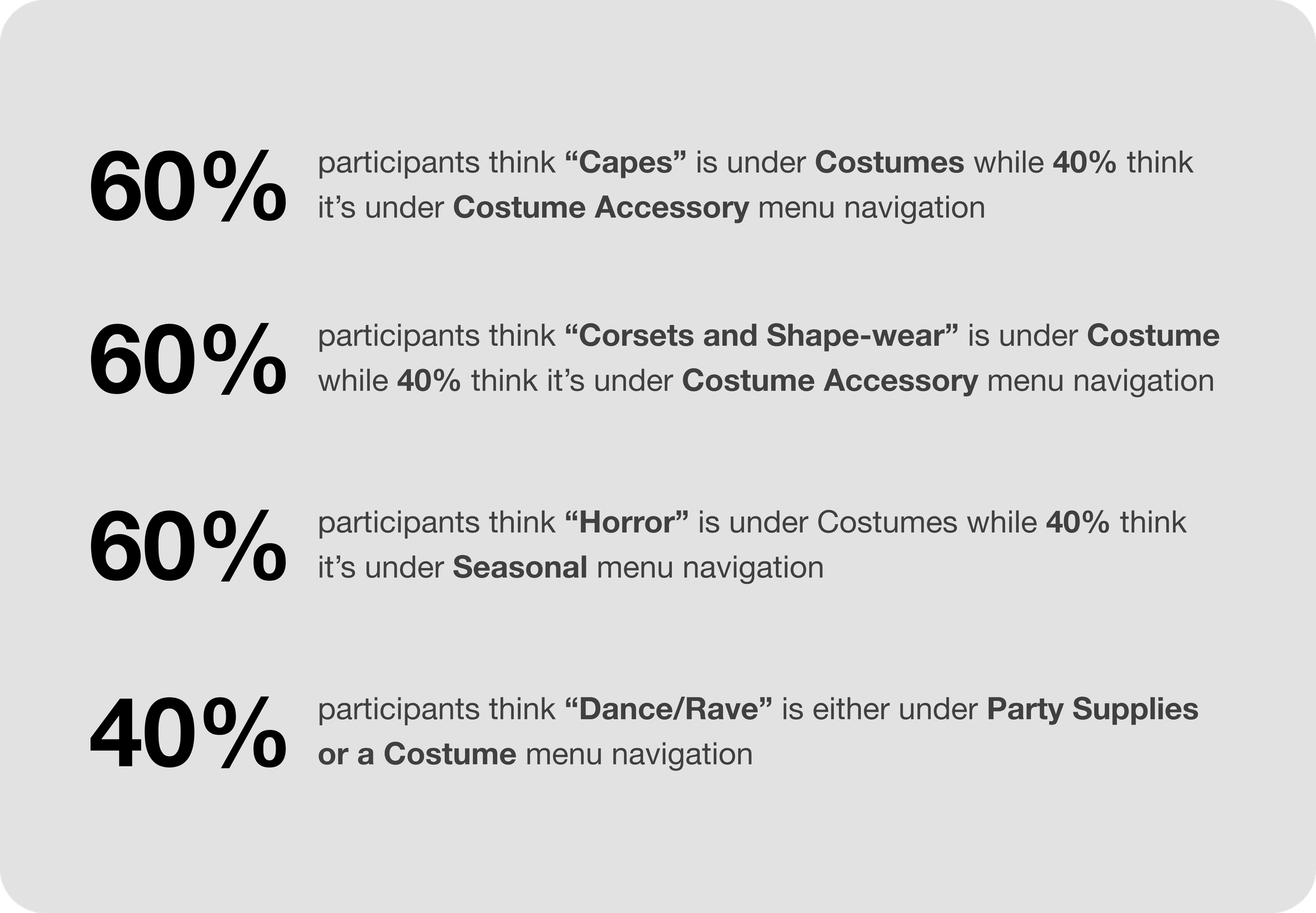
I wanted to see how folks shop online at Champion Party, so I had 5 people sort website menu categories . It turns out, identifying categories wasn't the problem – it was more about how clear the subcategories were named compared to the main categories.
Results
Recommendations
There was a major trend of users not categorizing items that were found under costumes because there was another main category called costume accessory.
Category Naming: Adding "costume" to category names reduces user confusion by clearly indicating the purpose of the items. Eg: “Capes Costume”
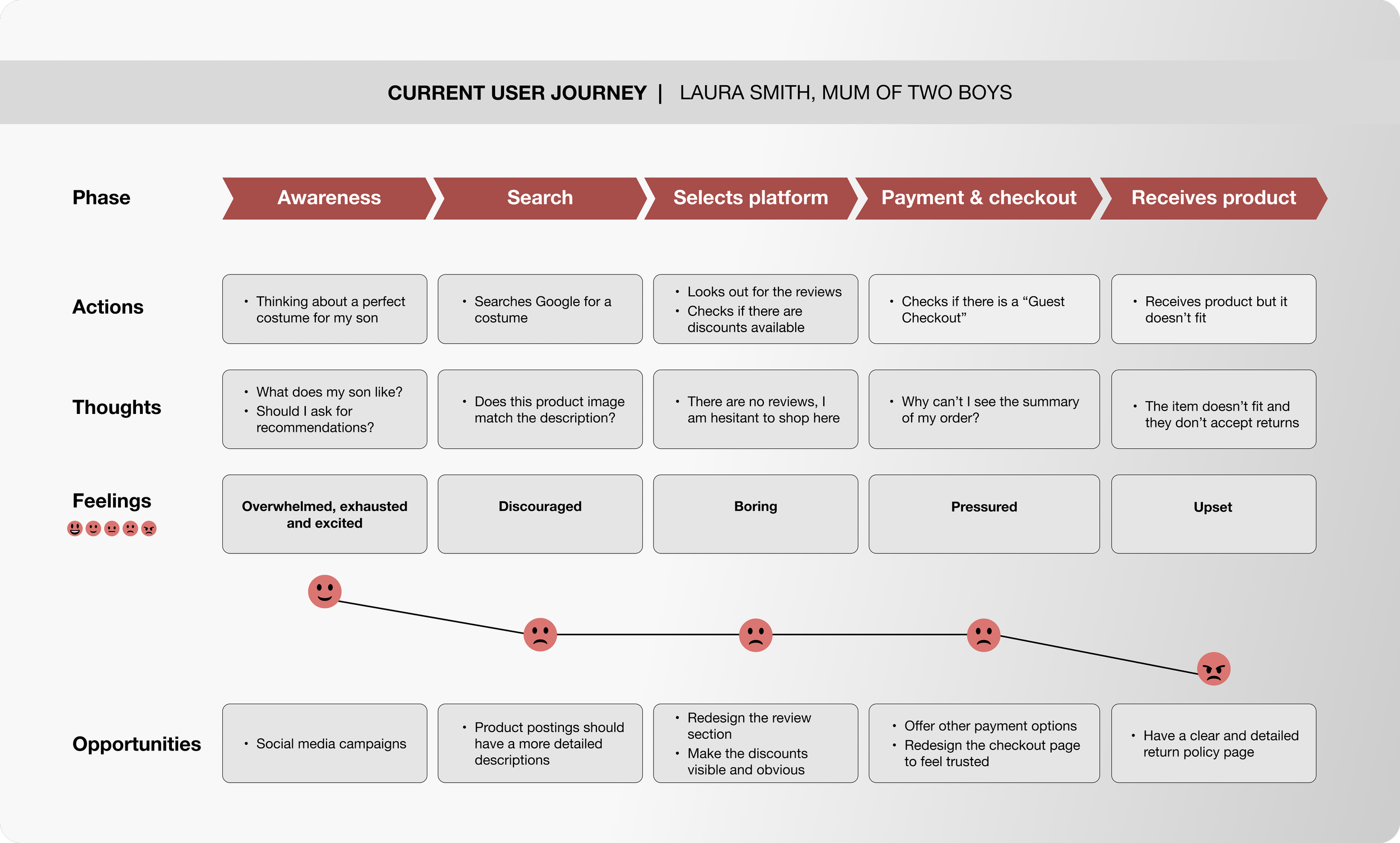
A user journey map revealed a negative experience in finding product information and return processes
JOURNEY MAP
Recommendations included;
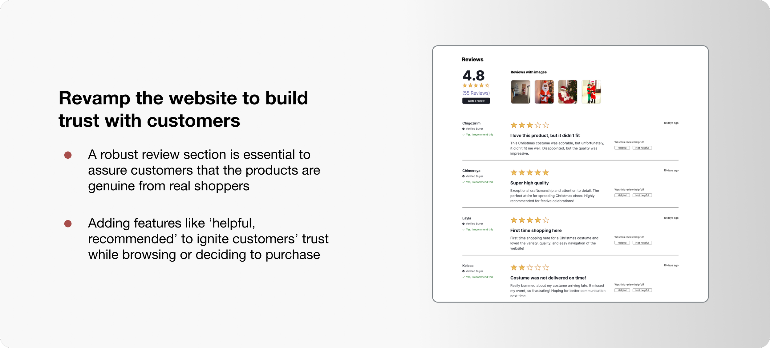
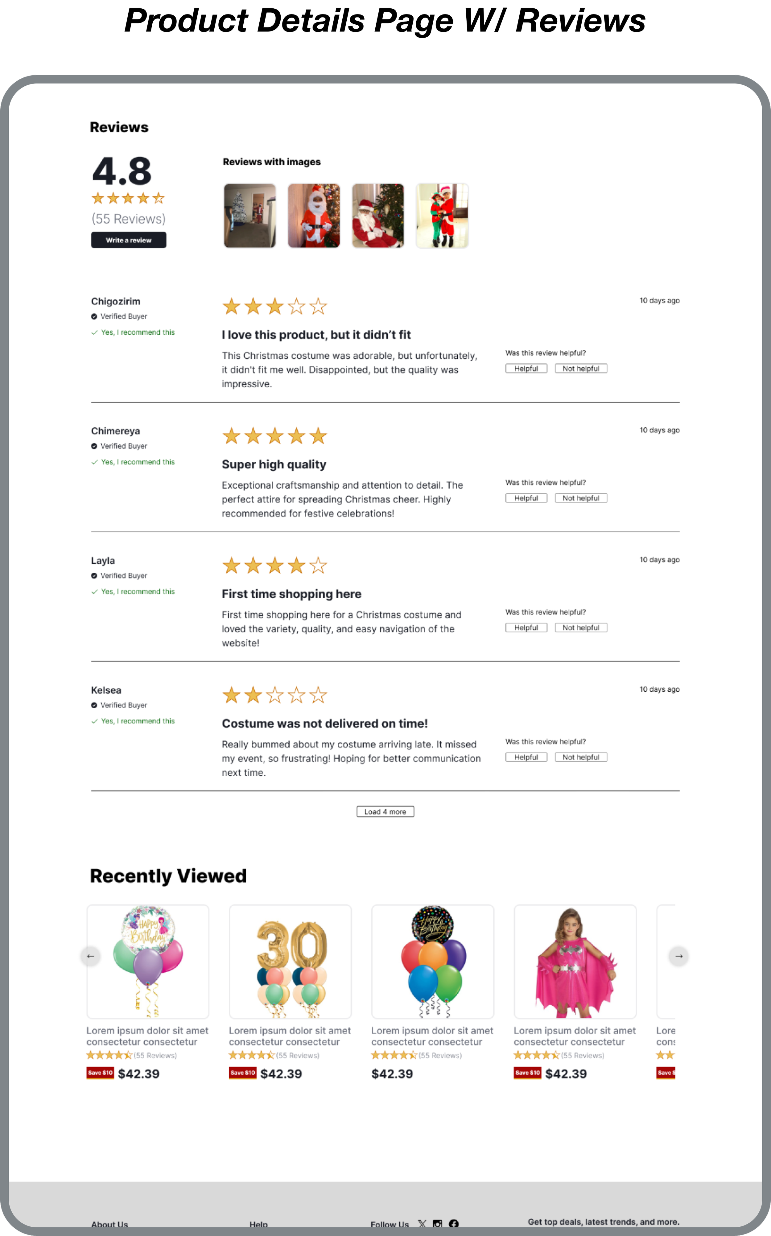
Redesigning the review section
Providing detailed product description and order summary
Streamlining the checkout process for improved user experience
DEFINE
These Questions Guided the Ideation Phase
HMW empower Laura to feel confident in her purchases?
HMW prioritize saving opportunities for Laura?
HMW guide Laura towards popular and high-quality products?
Enhancing Laura's Online Shopping Experience
PERSONA + PROBLEM STATEMEMT + HMW
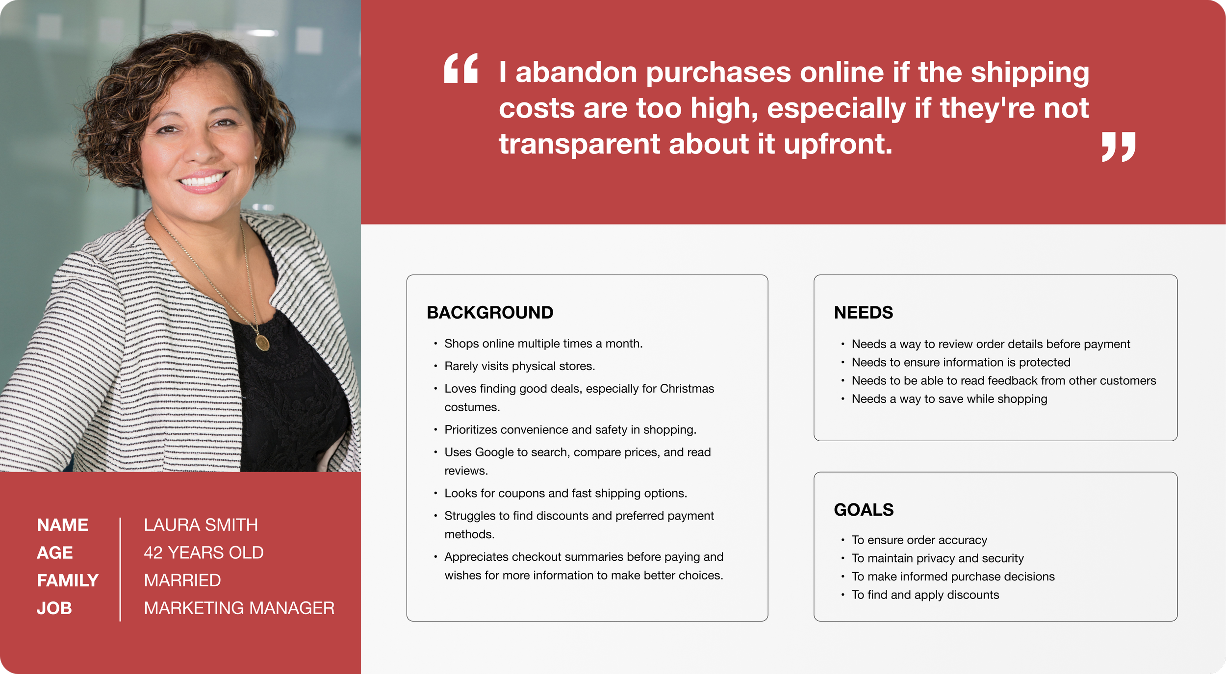
User interviews informed the creation of Laura, a persona reflecting common frustrations. Laura prioritizes saving items, finding discounts, and clear product information.
DEVELOP
Understanding User Needs was Crucial
USER FLOW
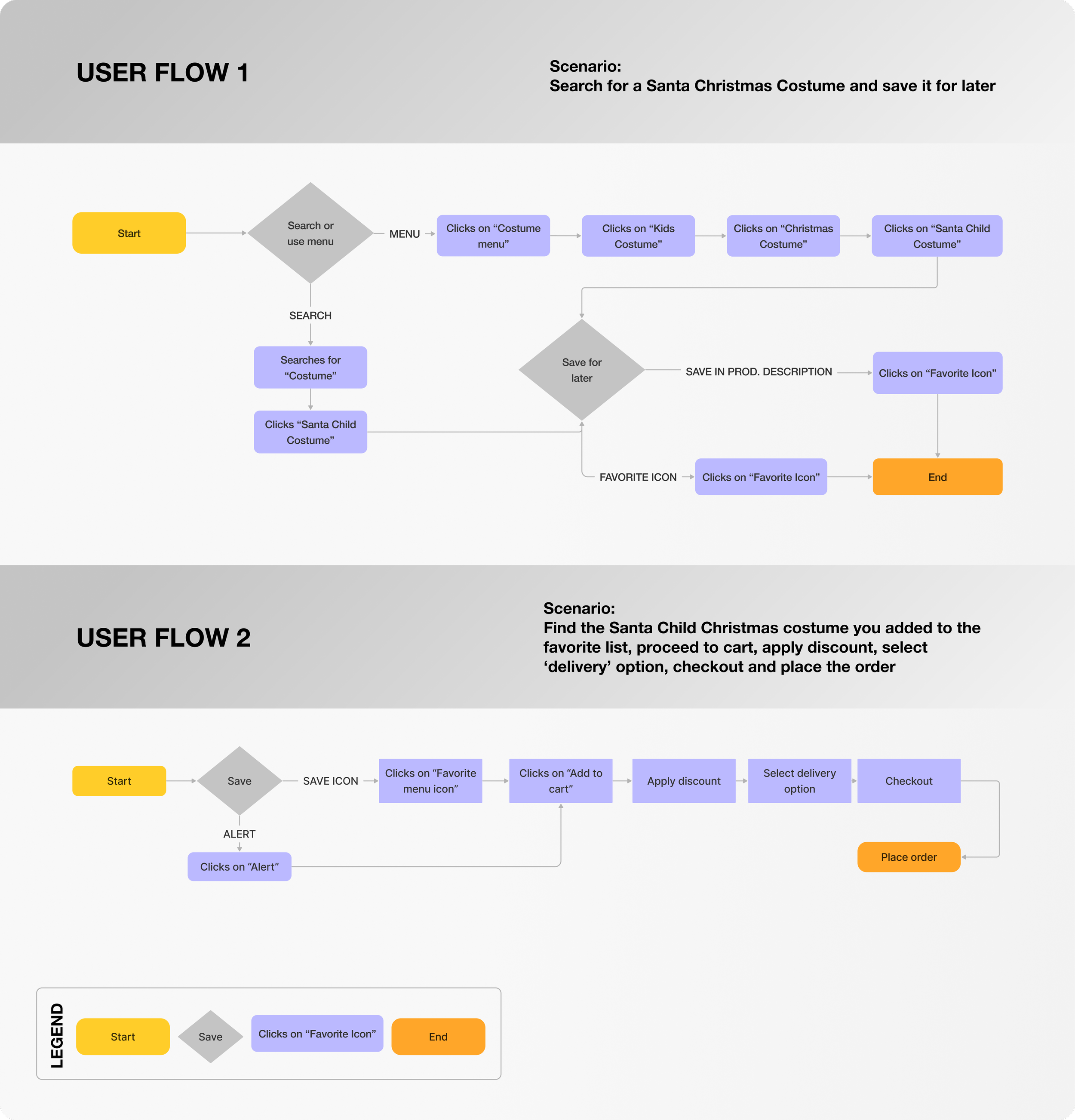
I designed two user flows focused on building trust and empowering informed decisions. The user flows incorporated features like:
Save for Later: This allows users to revisit items they're interested in, addressing the need for time to research and compare products.
Enhanced Product Information: This includes detailed descriptions, reviews, and size charts, helping users make confident purchase decisions.
Major Pages that Enabled Usability and Confidence
SKETCHES
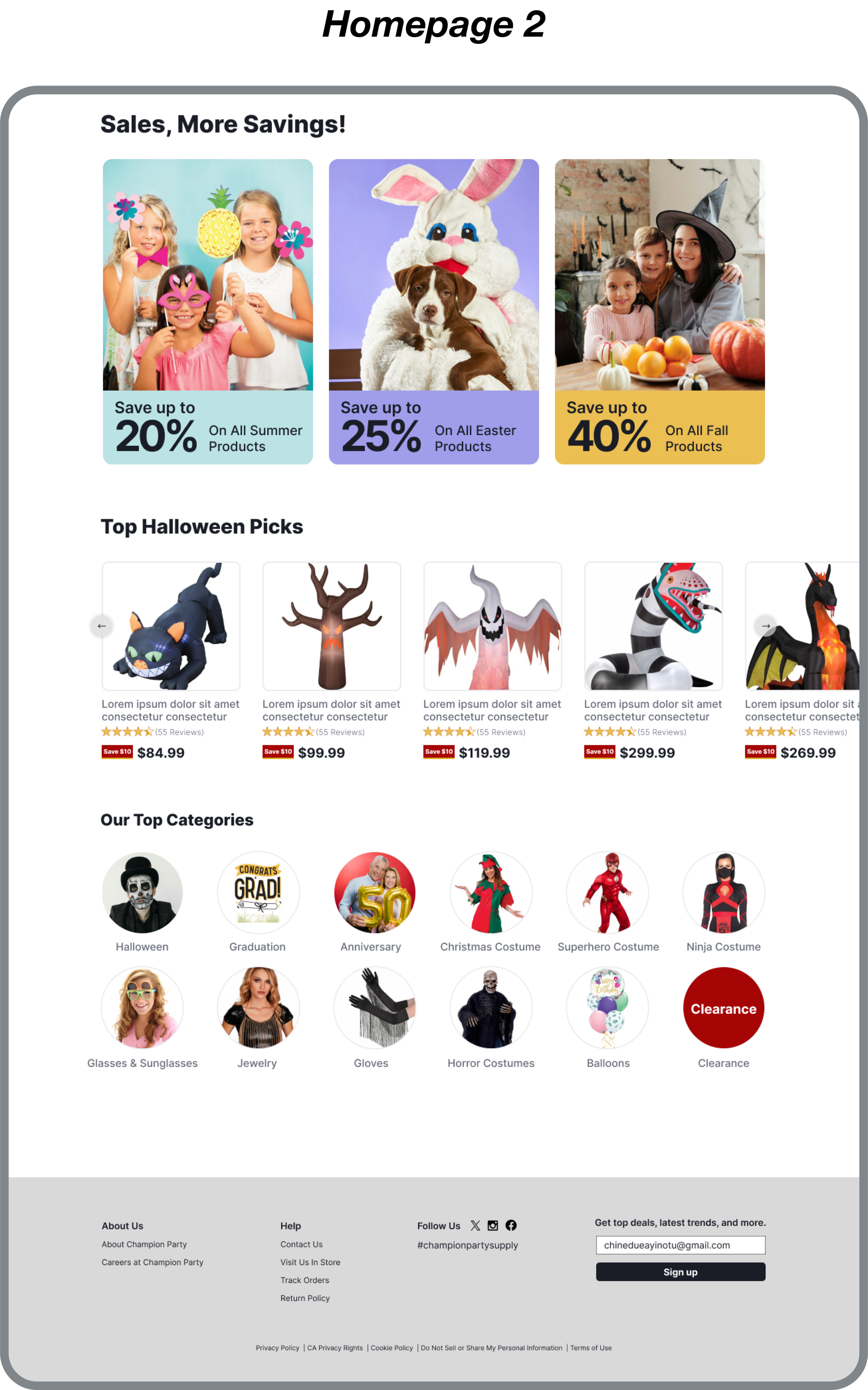
The initial design phase involved creating low-fidelity wireframes for the homepage, product listings, product details, and checkout process to prioritize key functionalities, clear information architecture, and intuitive navigation.
WIREFRAMES
User-Centered Refinements
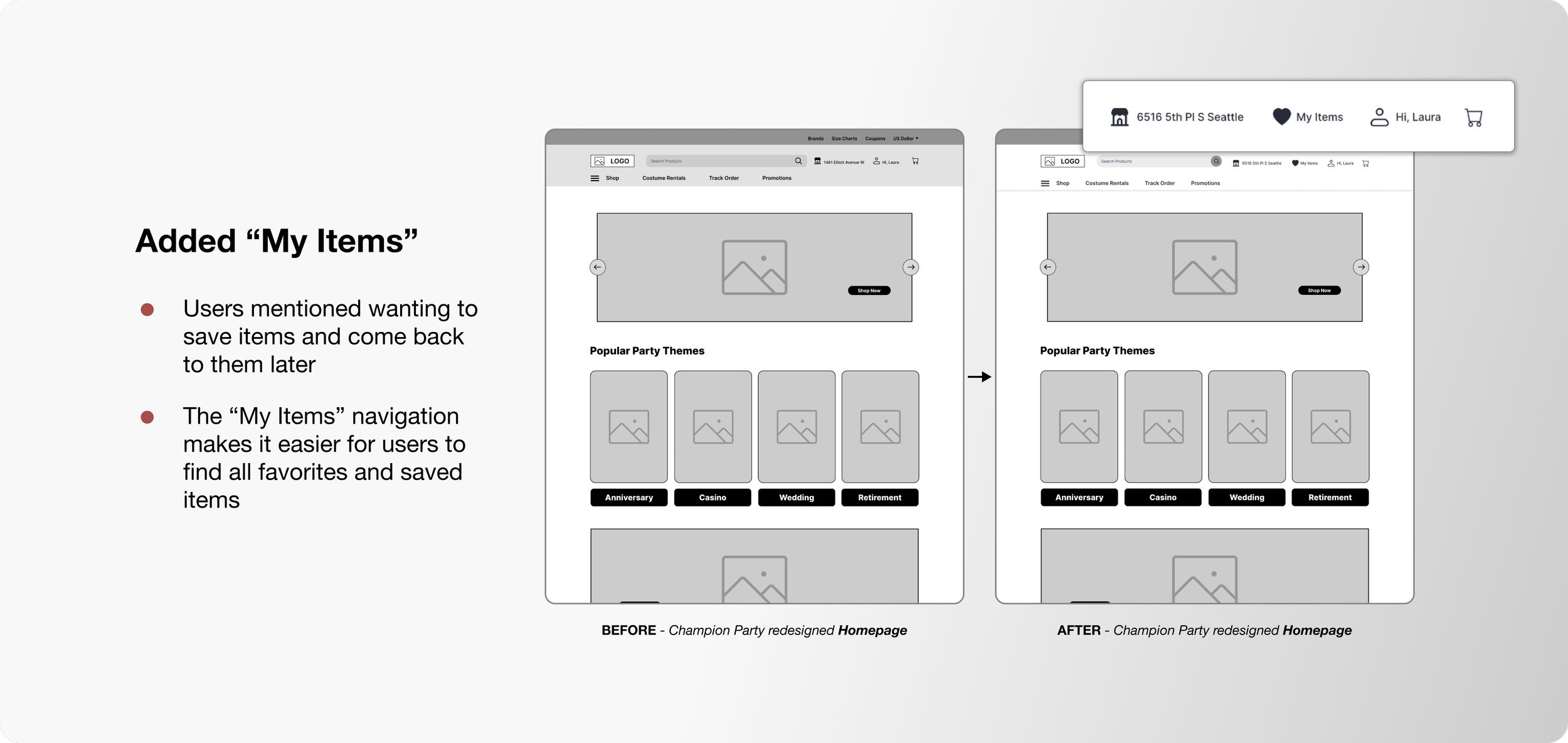
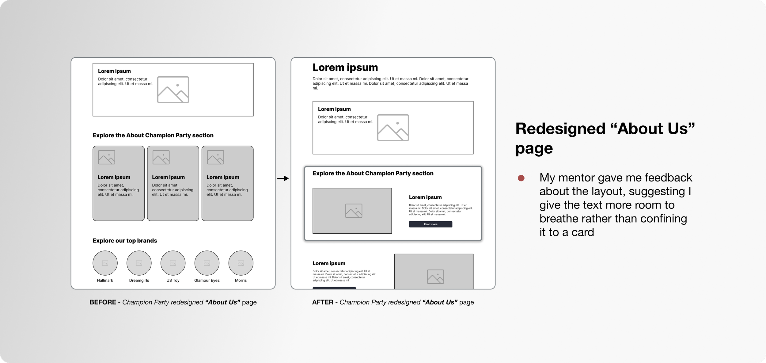
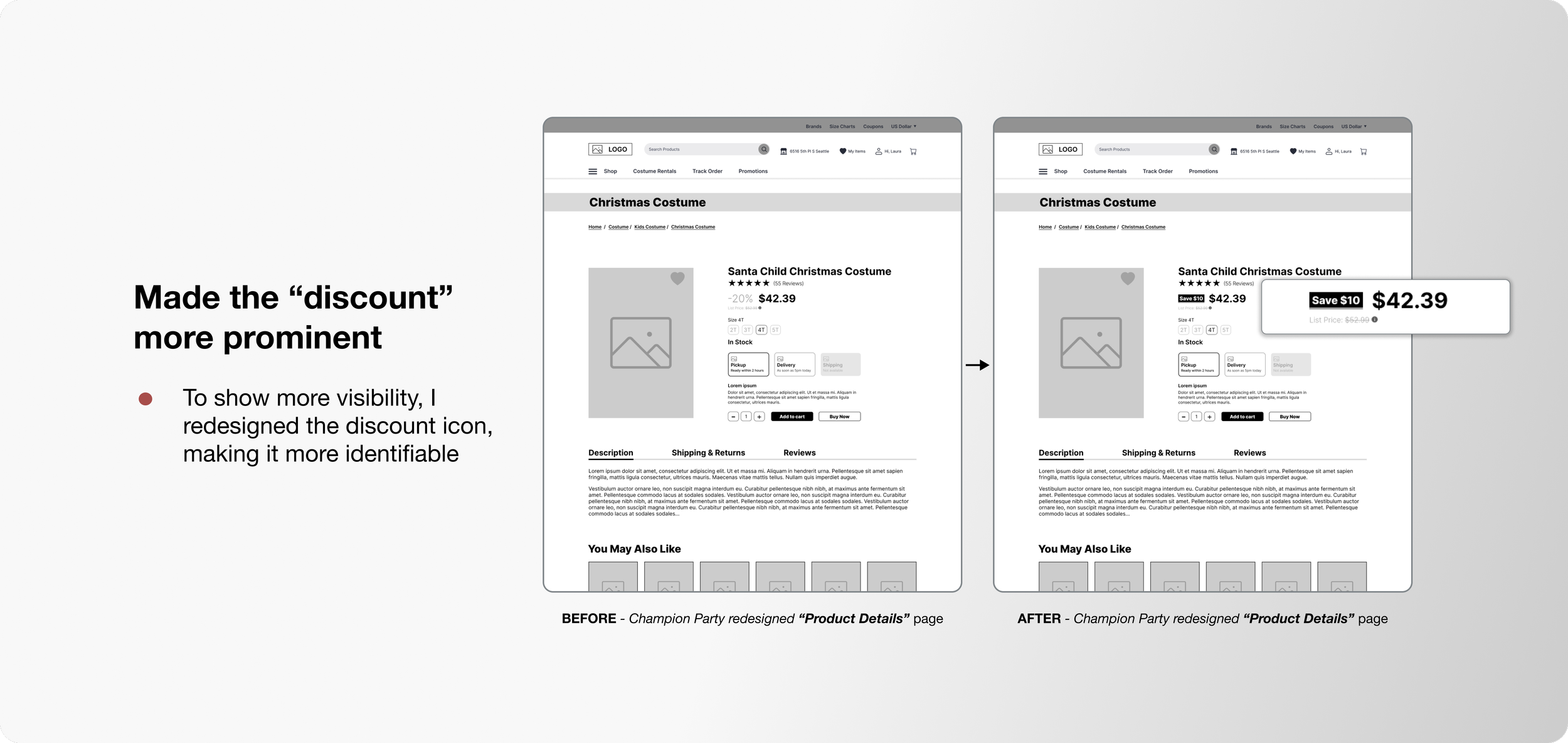
Listening to what users needed and incorporating my mentor's feedback, I went back to the drawing board and refined the wireframes. The result? An experience that's smoother, more intuitive, and truly user-centered!
USABILITY TEST INSIGHTS
Understanding User Preferences
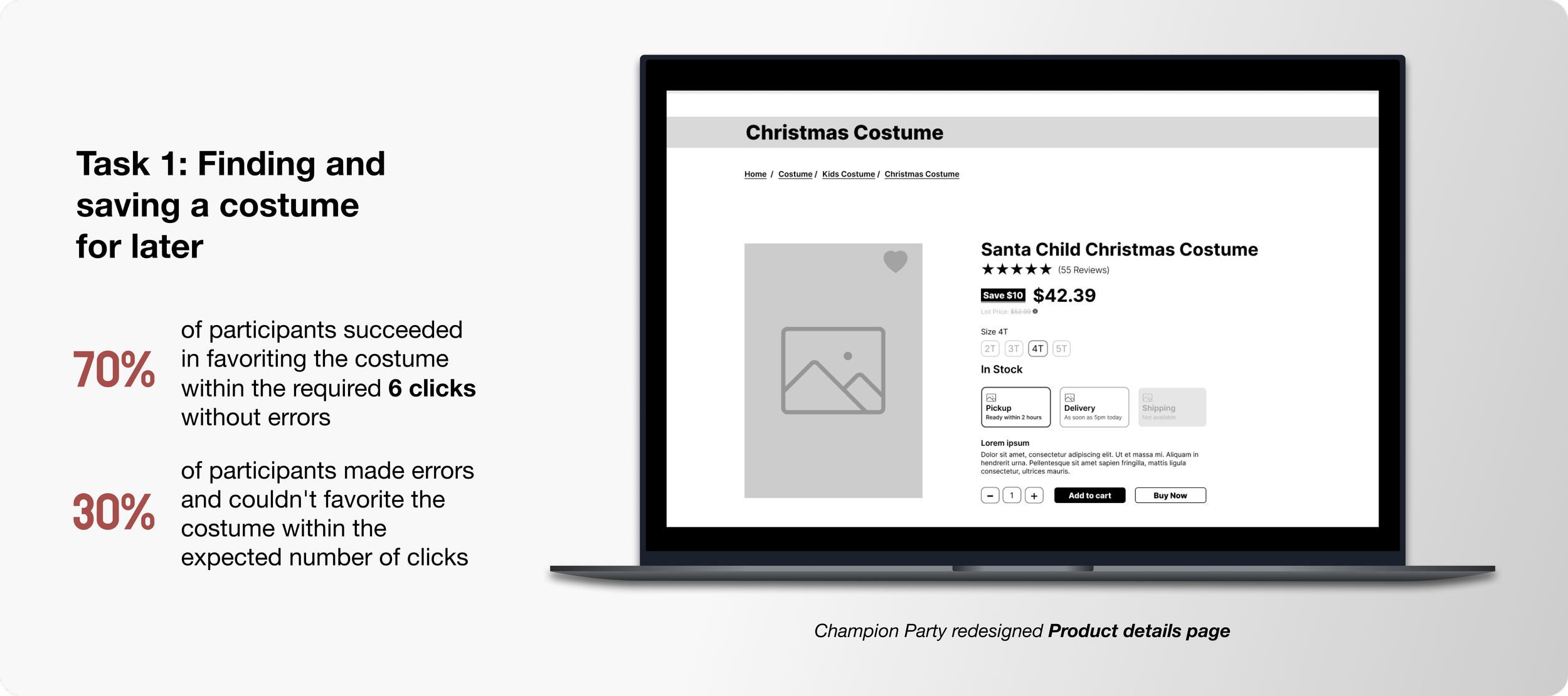
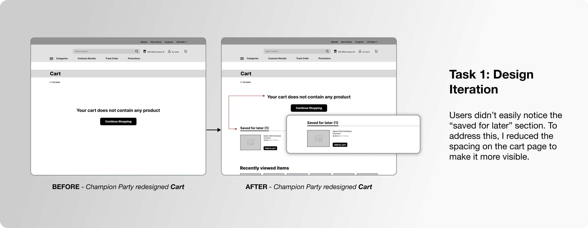
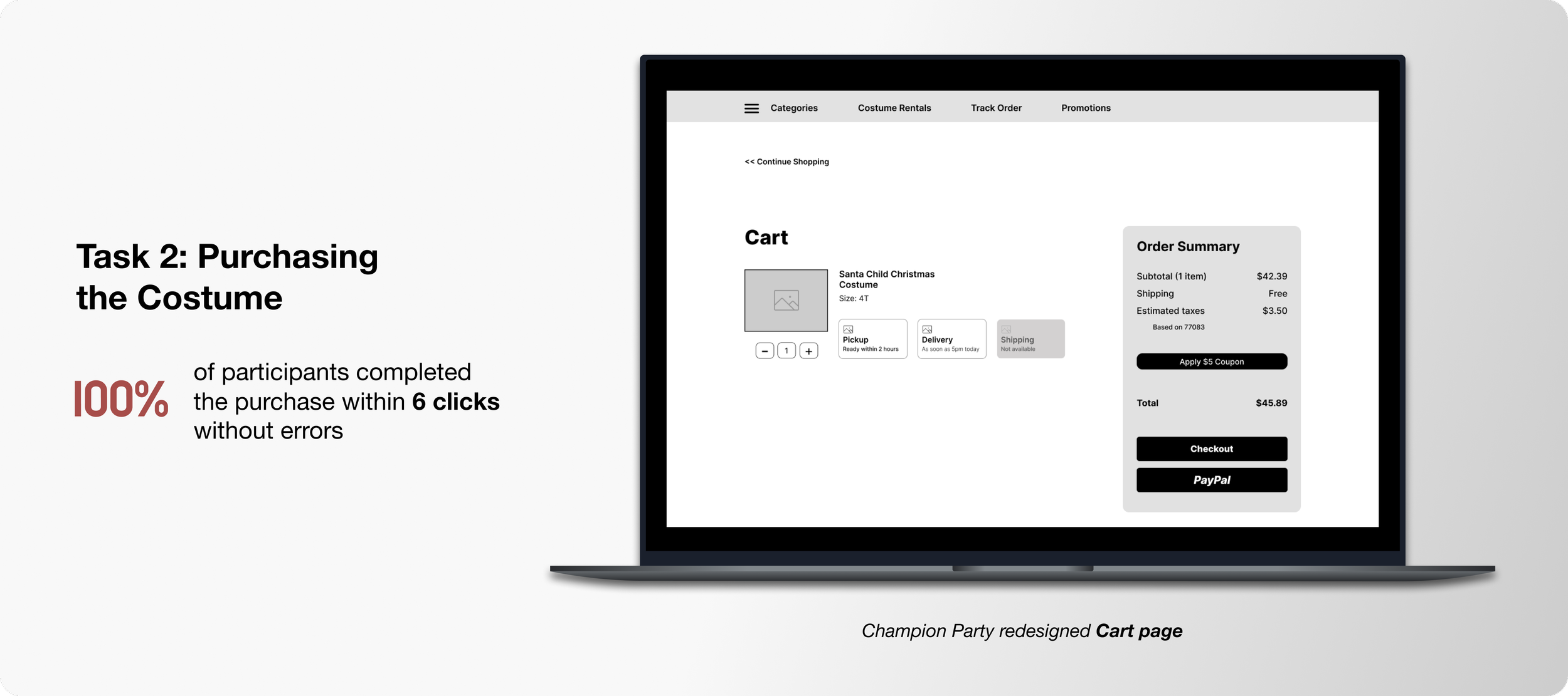
User behavior guided the usability test tasks. All interviewed users wanted to save items for later, so I focused on understanding this journey and the checkout process. Saving money was important, so I included a coupon feature in the checkout to see if users would use it.
STYLE GUIDE
Modernizing the Brand
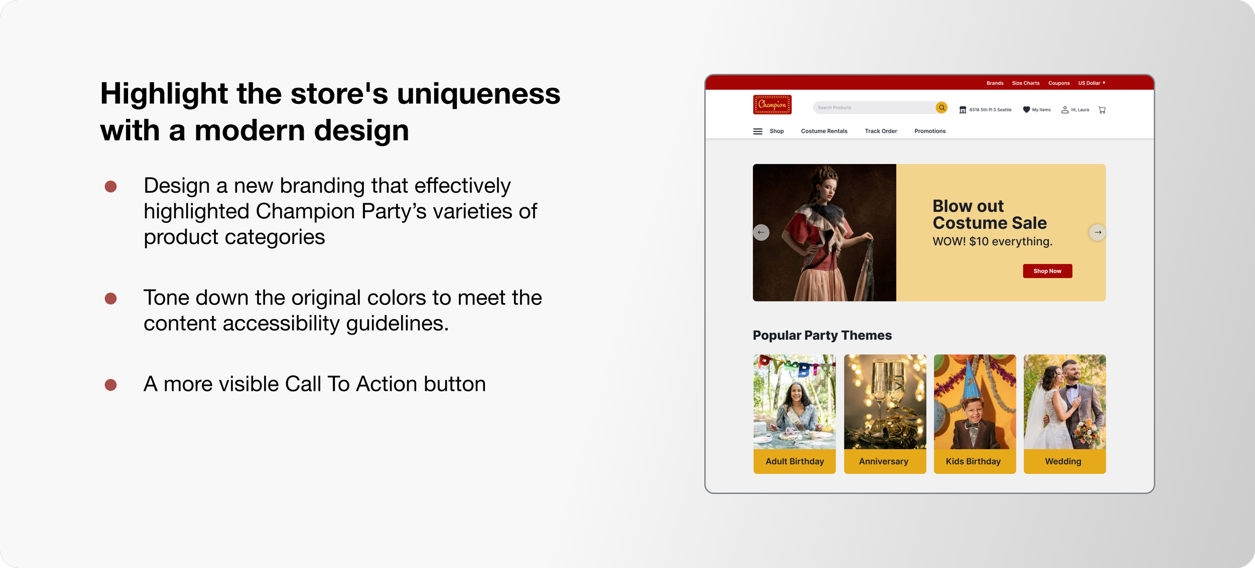
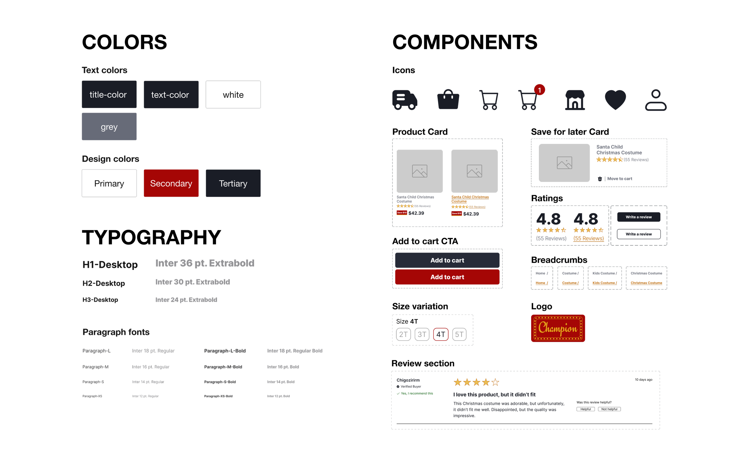
I chose a more modern red shade to move away from a "clown circus" feel, aligning with the brand guideline. The typeface (Inter) prioritizes readability with a modern look. Slightly rounded corners on icons and CTAs enhance interactivity for a smoother user experience.
HIGH FIDELITY DESIGNS
REFLECTION
Lessons Learned
Understanding User Needs: Extensive research, including reviews and interviews, highlighted user frustrations and guided the redesign to address real needs.
The Power of Iteration: Brainstorming and iterating on solutions, based on feedback and usability testing, were crucial for refining the design and enhancing the user experience.
Balancing Brand Identity with Usability: Moderating color choices and streamlining navigation helped balance brand identity with usability and accessibility.
Commitment to Continuous Improvement: Usability testing identified areas for improvement, and incorporating feedback was essential for ongoing enhancement.
Aligning Design with Business Goals: Design decisions were aligned with Champion Party Supply's goals, focusing on increasing engagement, improving conversion rates, and fostering trust.
Next Steps
Develop High-Fidelity Prototypes: Create detailed, high-fidelity design prototypes.
Conduct Further Usability Testing: Perform another round of usability tests to gather more feedback.
Collaborate with Developers: Connect with a developer to review the prototype and assess its feasibility for implementation.
Explore Hybrid App Design: If time permits, design a hybrid app to enhance cross-platform usability.
Glad you could make it to the end! 😊
Need a hand with a project or want to grab a cup of coffee?
Reach out at neduayinotu@gmail.com
MORE PROJECTS
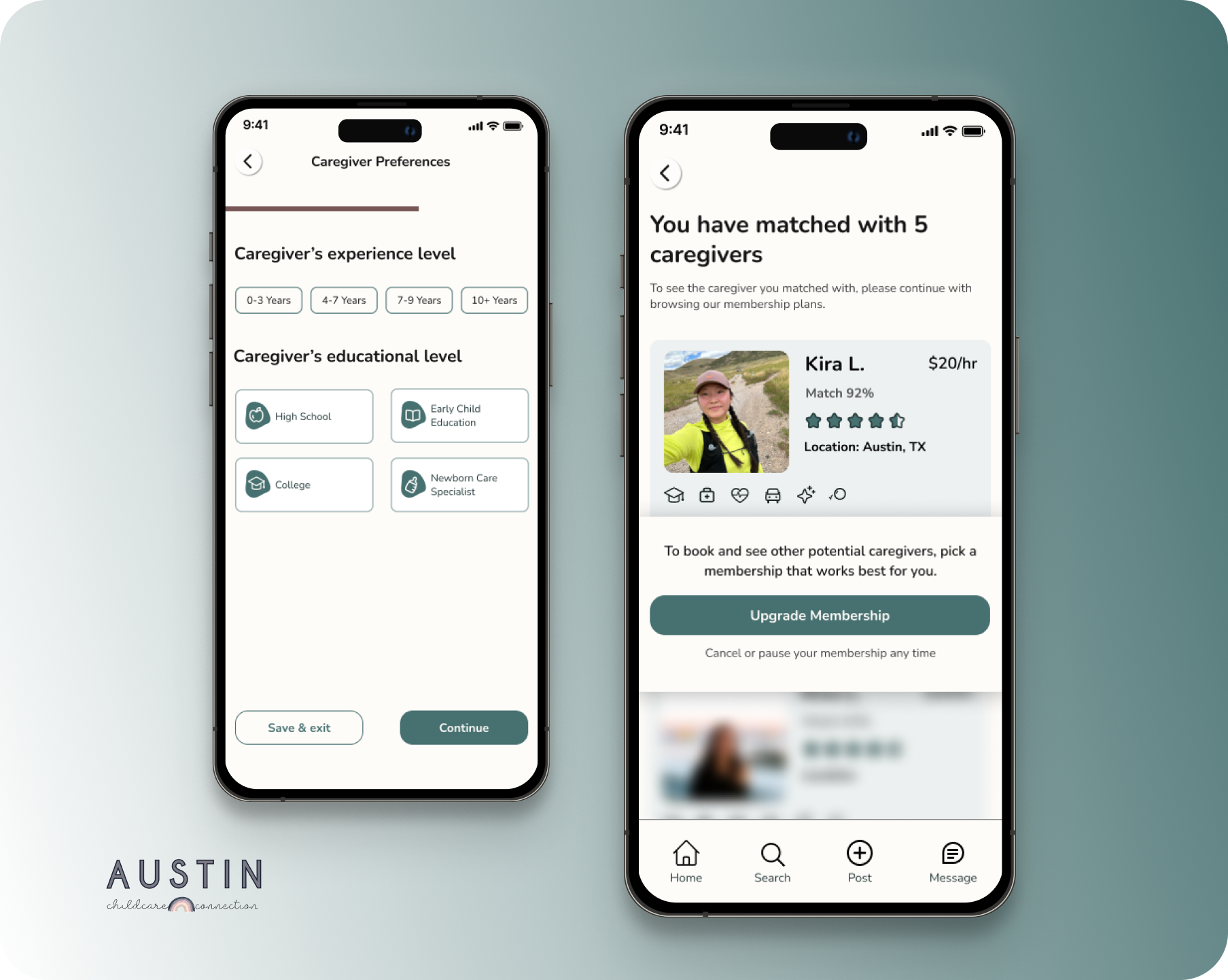
Austin Childcare Connection
Match parents with caregivers for jobs. Find work as a caregiver.
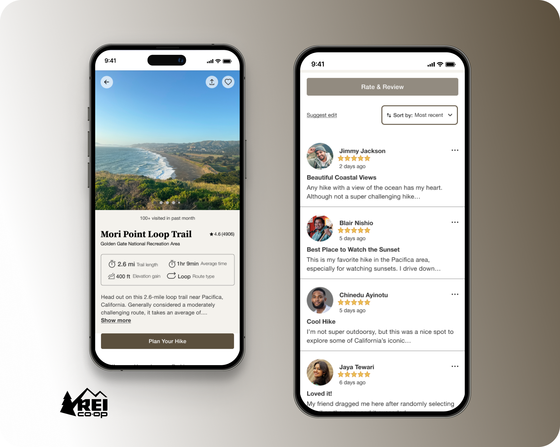
REI Ready
A Companion App Enhancing Outdoor Adventures

